Case Study:
Microsoft
Office ’13 Signature Themes
New In-Box Themes designed to evolve Office's theme architecture for the 2013 release.
At a Glance
The Office applications had introduced an all-new theme architecture with Office 2007, taking their first steps toward a unified semantic architecture that could extend common document style settings into any of the Office applications. In Office: Mac 2008 and Office 2010, I'd pushed this new architecture to the limits – creating dozens of the most eye-catching In-Box themes and templates the Office applications had ever shipped. For the 2013 release, Microsoft wanted to build on this effort to completely reinvent PowerPoint's design image for a new era.
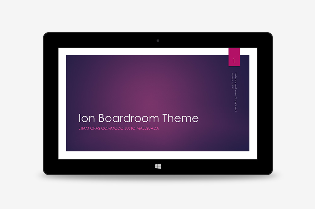
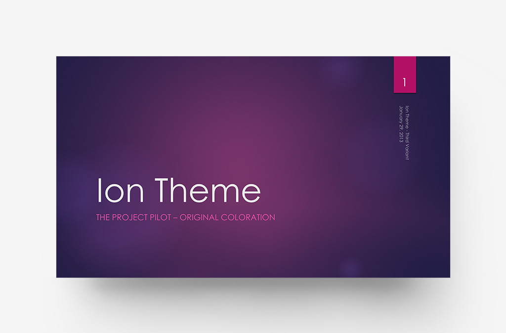
Working remotely with Microsoft's team, I researched customer attitudes toward PowerPoint and ways the In-Box theme designs played a role in influencing those attitudes. I designed the Ion theme as a prototype for a new, more-informed approach that spoke to my findings head-on – orienting the upcoming library toward a higher standard of design fundamentals and themes with a more expressive, cinematic edge.
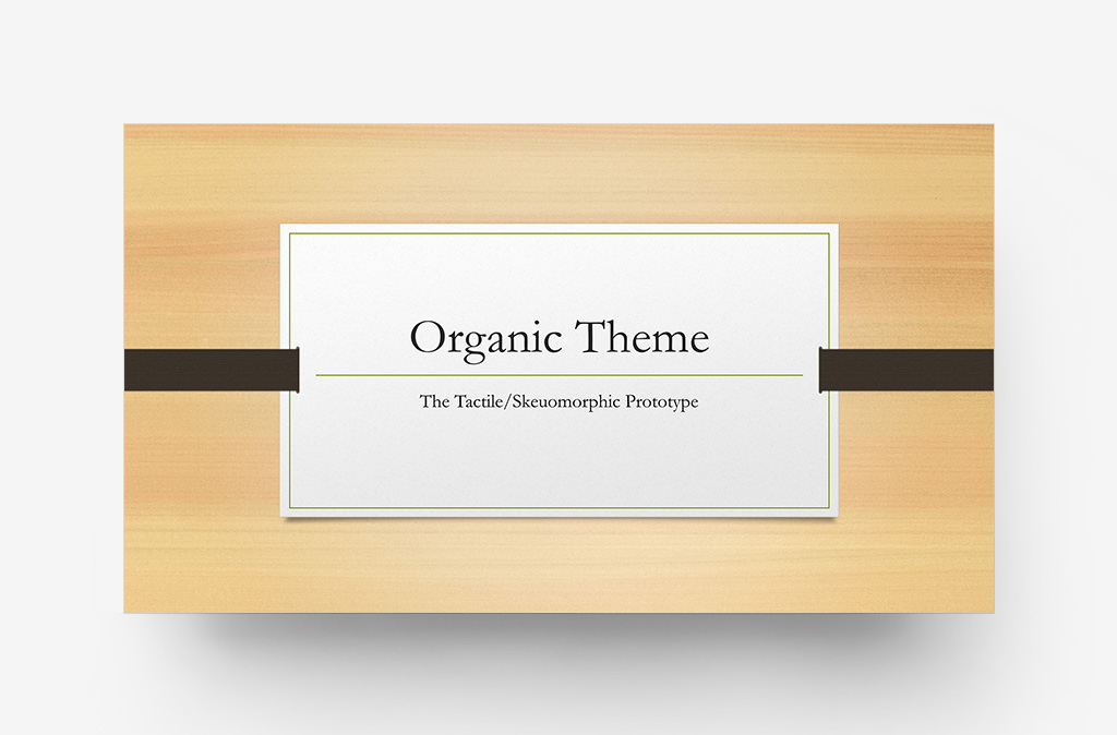
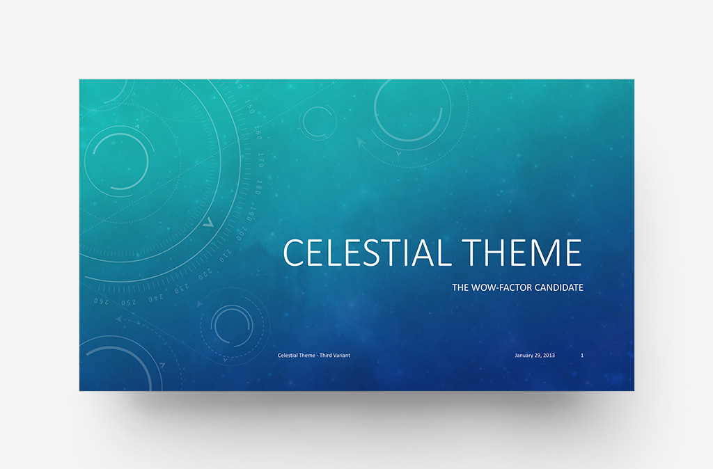
I helped to develop a new standard for designer-driven Theme Variants, allowing authors to pivot between multiple tailored variations of a chosen theme at will, and developed fifteen additional themes for the Office 2013 launch library, further extending key theme styles into Word and Excel with custom Building Block and Template designs.
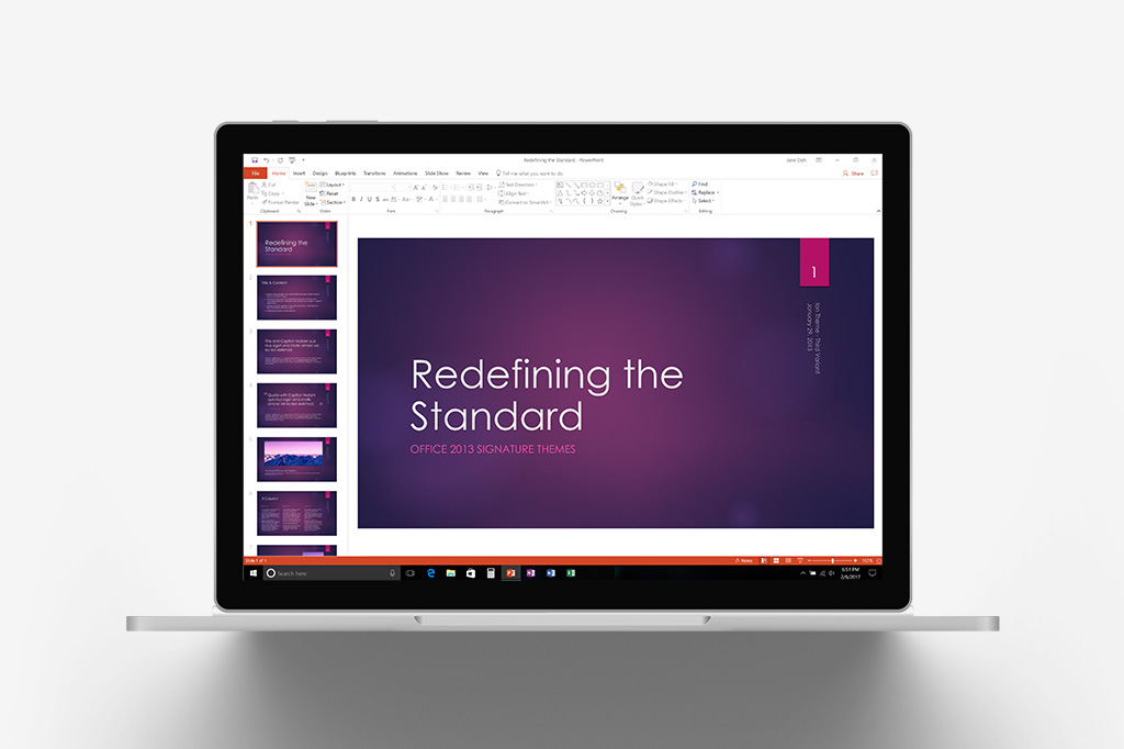
A Wider, More Cinematic Experience
PowerPoint ’13 would be noticeably different, right from the start screen. An updated start experience would greet authors with an entirely new library of themes to choose from, all designed and optimized for widescreen/ HD as the new default format for PowerPoint presentations moving forward.
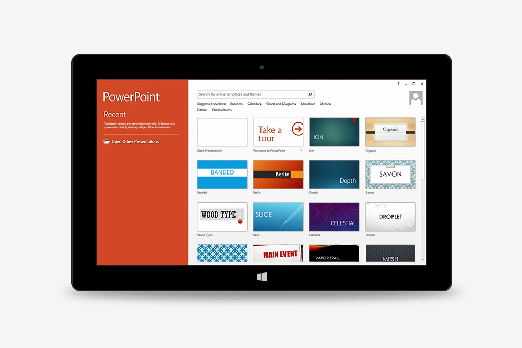
Tailored Variation
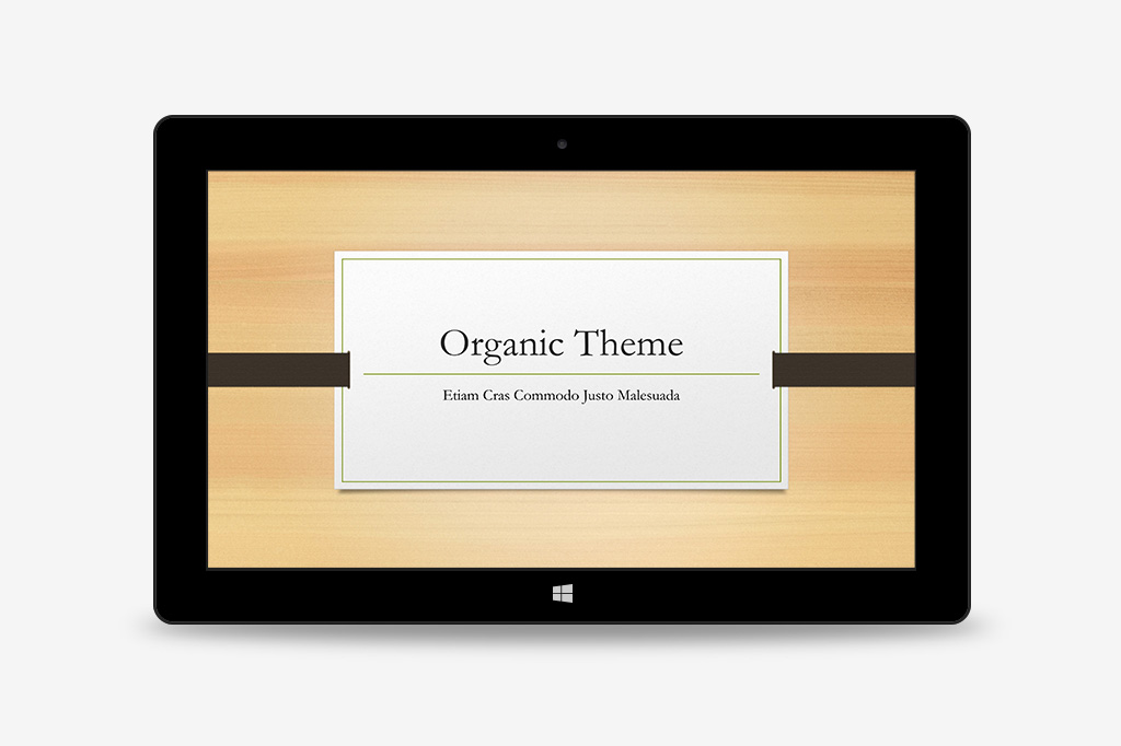
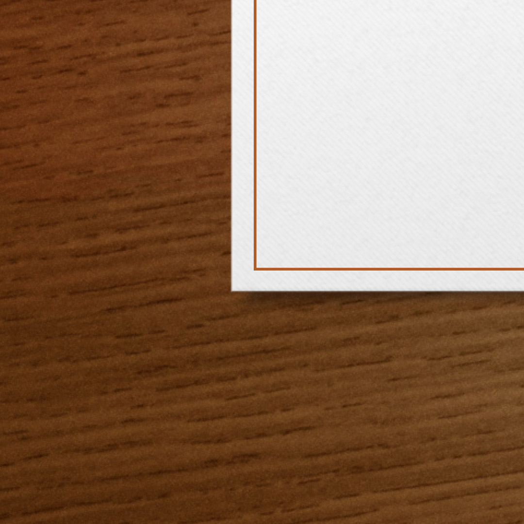
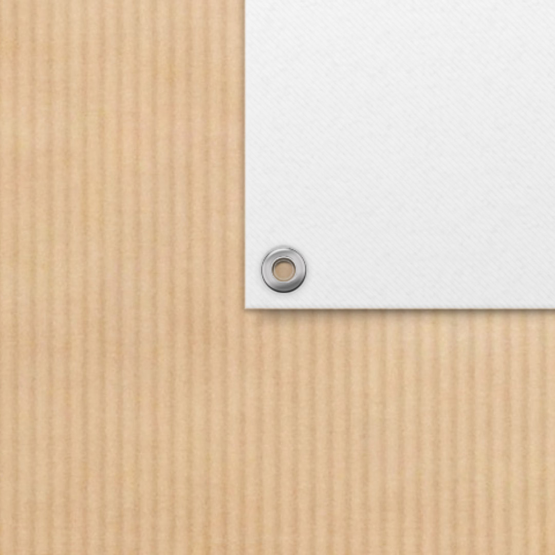
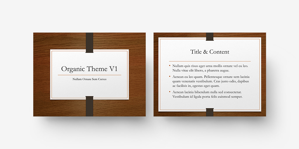
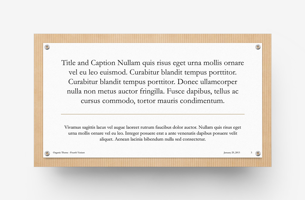
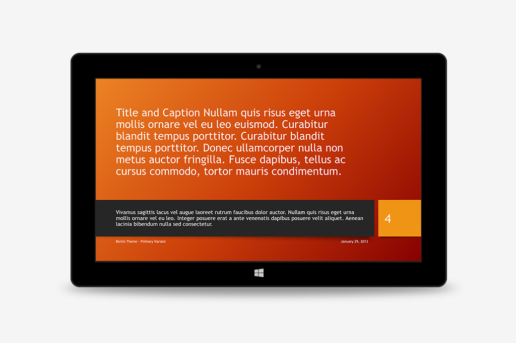
The updated THMX format introduced new designer-driven Theme Variants, with multiple pre-styled variations built-in to every In-Box theme – allowing authors to choose their preferred combination of color, fonts or materials for any of the new themes right from the start.


Expanded Layouts
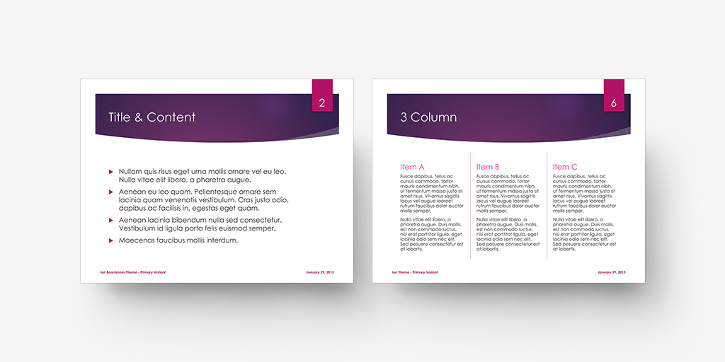
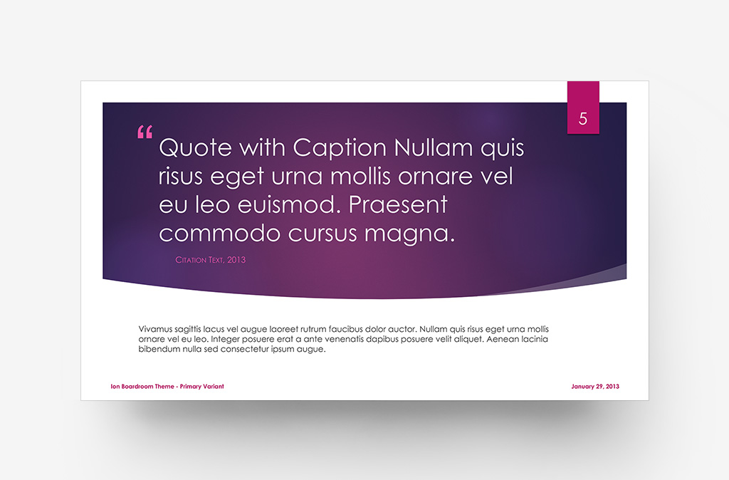
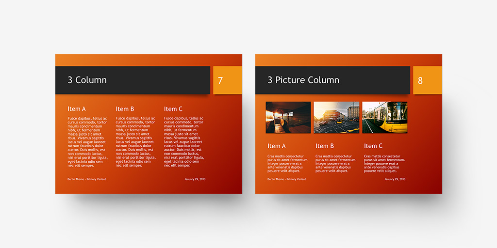
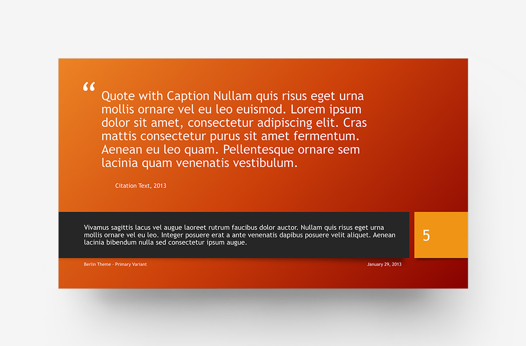
New layout styles, including Quotations, Multi-column setups, and Assertion/ Evidence masters like True or False offered authors all-new ways of visualizing their content in select theme styles.
Mixed Modalities
The Ion pilot included unique Venue Modality options, allowing authors to pivot between the Auditorium-oriented cinematic base theme and a hybrid Boardroom modality better-suited for charts, tables and dense content slides.
